Coloured Concrete Selection Guide for Your Home
A coloured concrete surface can make a driveway feel more considered, give a patio a warmer finish, or help a pool area sit naturally within the landscape. But the right choice is not simply a matter of picking a shade from a chart. This coloured concrete selection guide explains what affects the finished result, where different tones work best, and how to choose a surface that remains practical for years to come.
For homes and commercial properties across South East Queensland, colour needs to work with strong sun, sudden rain, outdoor living and everyday use. A finish that looks excellent in a small sample may appear quite different across a full driveway or large entertaining area. Careful planning before the pour makes the difference.
Start with the purpose of the surface
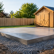
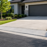
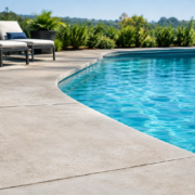
The best colour is one that suits how the area will be used. A front driveway needs to handle tyre marks, dust and regular vehicle traffic. A patio needs to complement the home while remaining comfortable and easy to maintain. Around a pool, heat underfoot, glare and slip resistance deserve just as much attention as appearance.
For commercial spaces, the priority may be a professional, consistent look that can stand up to trolleys, vehicles, foot traffic and routine cleaning. Mid-tone colours are often a practical choice in busy areas because they are less likely to show every mark than very light or very dark finishes.
Colour should support the job of the concrete rather than compete with it. A well-selected tone can improve street appeal, define outdoor zones and create a more polished result, while still allowing the surface to do the hard work.
Consider your home’s existing colours
Concrete covers a large area, so it should relate to the fixed features already on the property. Look at the roof, external cladding or brickwork, window frames, fences, retaining walls and landscaping. These elements will still be there long after outdoor furniture and paint colours change.
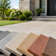
Earthy shades such as sandstone, beige, terracotta and warm brown work well with natural stone, brick façades and established gardens. Charcoal, graphite and cool grey tones can suit contemporary homes with dark joinery, monochrome palettes or rendered walls. Softer greys and muted neutrals are versatile options when you want the concrete to complement the home without becoming the main feature.
It helps to decide whether you want contrast or continuity. A dark driveway against a light-rendered home can create a crisp, modern edge. Choosing a similar tone to the façade produces a calmer, more unified appearance. Neither is automatically better – the right approach depends on the architecture, site size and amount of surrounding hardscape.
Test samples in their actual location
Never judge concrete colour solely under showroom lighting or from a photo. Place samples outdoors beside the house and view them at different times of day. Brisbane and Gold Coast sunlight can make pale colours appear brighter and dark shades more intense than expected.
Also account for adjacent materials. A grey that looks neutral beside white render may take on a warmer or cooler cast next to brick, timber or stone. If the project includes exposed aggregate, paving or coping, compare the materials together before finalising the selection.
Think about heat, glare and day-to-day upkeep
Dark colours absorb more heat, which can make them less comfortable in fully exposed areas. This is particularly relevant for pool surrounds, patios and footpaths where people commonly walk barefoot. Lighter colours generally stay cooler, though a very pale finish can create glare in open, sunny locations.
A mid-tone finish often provides a sensible balance. It can reduce glare compared with bright white or cream, while avoiding some of the heat associated with charcoal and deep brown. The amount of shade from awnings, trees and nearby buildings also changes the decision. A dark feature path in a shaded garden may work beautifully, while the same colour across an unshaded pool deck may not be as practical.
Maintenance is another consideration. Light concrete can show mud, leaf tannins and tyre marks more readily. Very dark concrete may reveal dust, pollen and dried water spots. A warm grey, natural stone tone or medium earthy shade is often forgiving for driveways and high-traffic outdoor areas.
Choose a finish, not just a colour
The surface texture has a major effect on how colour is perceived. Smooth trowelled concrete reflects more light and can make a colour look cleaner or deeper. Broom finishes scatter light, creating a more subdued appearance and adding useful texture underfoot. Exposed aggregate introduces natural variation through the stones, while a coloured base helps tie the overall finish together.
This is why a colour selection should be considered alongside the preferred finish. A subtle grey in a smooth, polished-style surface creates a different impression from the same grey in a textured stencil or exposed aggregate application.
For areas likely to become wet, surface grip should be part of the conversation from the beginning. Pool surrounds, sloping paths, entries and commercial walkways benefit from a finish designed for safer movement in changing conditions. Appearance matters, but a decorative surface must remain fit for purpose.
Understand why colour can vary
Coloured concrete is made from natural materials, and minor variation is normal. Cement, sand, aggregate, moisture levels, curing conditions and the finishing process can all influence the final appearance. The colour seen on the day of installation may also look different once the concrete has cured fully.
Large areas can show gentle tonal movement rather than a perfectly flat, paint-like result. This is generally part of concrete’s character, especially in outdoor settings. Good preparation, consistent batching and experienced placement help produce an even, professional finish, but realistic expectations are essential.
For this reason, it is wise to select a colour you will be happy to see with natural variation. Mid-tones and earth-inspired shades usually accommodate this character well. If a highly uniform decorative appearance is the priority, discuss the most suitable finish system for the project before work begins.
Match the colour to the scale of the area
Colour has visual weight. Darker concrete can anchor a large façade and create a strong border around gardens or lawn. On a small courtyard, however, it may make the space feel more enclosed. Light and mid-tone colours can help compact outdoor areas feel more open, especially when paired with pale walls and simple planting.
For broad driveways or commercial hardstands, a restrained colour is often more enduring than a bold statement shade. The area will be viewed from the street, from inside the property and at close range, so it should remain appealing from every angle. A neutral base also gives future flexibility if landscaping or exterior finishes are updated.
Feature areas are where stronger contrast can be effective. A darker path can define the route to an entry, while a warmer patio tone can distinguish an entertaining zone from the driveway. Using colour with purpose creates a finished result without making the property feel overly busy.
Plan for the whole project
Before choosing a colour, consider the complete concrete layout. Will the driveway connect to side paths? Does the patio lead to a pool area? Are garden edges, steps, drainage points or driveway extensions part of the same visual field? These connections influence whether one consistent colour or a coordinated combination will work best.
Drainage and site preparation are equally important. Even the best decorative finish will not perform as intended if water is allowed to pond, subgrade preparation is inadequate or joints are poorly planned. Experienced concreting advice should cover the practical details as well as the visual result.
At Creative Concrete Constructions, colour selection is approached as part of the wider design and installation process. The aim is a surface that suits the property, performs in local conditions and is finished with the care needed for lasting appeal.
A practical coloured concrete selection guide
When narrowing down options, begin with the area’s function, then assess sun exposure, surrounding materials and preferred texture. View real samples outdoors, allow for the natural character of concrete, and choose a tone that will still suit the property when seasons and styling preferences change.
The strongest choice is rarely the boldest one. It is the colour and finish that looks right against your home, feels practical under everyday use, and gives you confidence each time you arrive at the front door or step outside.